Introduction
A recent milestone for me is finally putting together my personal website. Though I'm not expecting this website to be much more than a pointer to where else you might find me, I wanted it to show my personality and to give some examples of things I find inspiring.
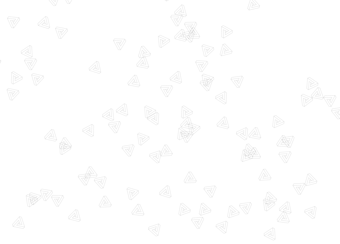
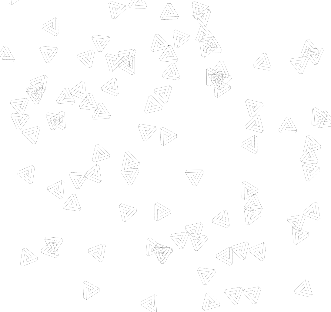
If you've checked out the website, you'll have noticed the floating icons distracting you from from the content I've put on the site. I don't care, they're far cooler than anything I would have to say. These, if you didn't know, are called penrose triangles:

These triangles are impossible in euclidean geometry, and are the sort of optical illusions that might remind you of the artist Escher's work. For me, they are the simplest way to make your head spin using just a pen & paper; if you've spotted me doodling in meetings (me? never!), I'm probably drawing some of these - I think they're brilliant.
How I did this
Enough nerding out. After all, the point of this post is to go through how I added them to my site. More specifically, how I made them do that stuff with pure CSS. Here's a quick overview of my approach:
- I made the triangles myself on procreate. I enjoy messing around on the family iPad, and figured it might come in handy having these assets in future.
- I used SASS for styling, which compiles into CSS, so that I can utilise various At-Rules to make this CSS-only.
- Penrose triangles aren't the only thing I find cool, so I wanted the app to iterate through all the floating icons that might be bundled in my app and randomly decide on an amount of them to use. This way, I might have time to create some Möbius strips, Rubiks cubes, Poké Balls, whatever.
I wanted the icons to idly float around the background of my website in random directions. At the same time, I didn't want my website to be full of loads of hacky javascript code, so I thought it would be fun to try and do this in pure CSS. Without the benefit of hindsight I decided to name these icons Floaters; something I now regret. Regardless, it reminds me of one of my favourite quotes:
There are only two hard things in Computer Science: cache invalidation and naming things - Phil Karlton
With my consultancy hat on, here was my acceptance criteria:
- Icons are randomly positioned on the page.
- Icons float around in random directions.
- Icons have a random degree of rotation.
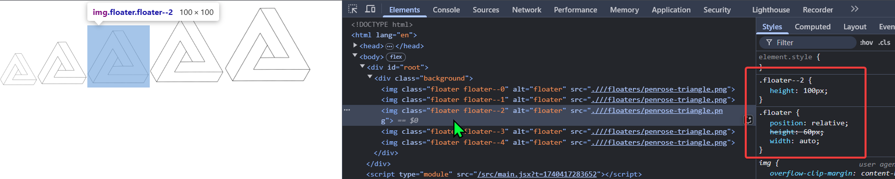
First, I wanted to prove the concept. I needed to prove that I could apply custom behaviour to each icon without writing massive amounts of duplicated CSS. I know that I have tabs on the index (a unique identifier) when iterating through the Floaters, but how do I pass that through to the styles? I'm not much of a front-end developer, but I like using the BEM methodology for styles so that my DOM looks like the below:
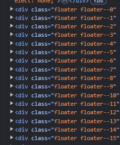
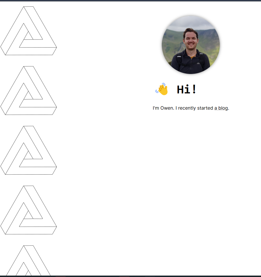
Now that each Floater has its own unique class name, I can style them differently. I can also use @for so that I don't have to duplicate the styles for each one:
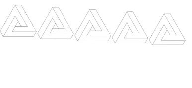
.floater {
  $n: 5;
  @for $i from 0 through $n {
    &--#{$i} {
      height: 60px + $i * 20px;
    }
  }
}
This means that each consecutive Floater gets bigger by 20px, like so:
Now we know we can style them differently, that means each Floater can have its own animation. Let's start small; simply moving up and down:
  $n: 9;
  @for $i from 0 through $n {
    @keyframes floater#{$i} {
      0% {
        transform: translateY(0);
      }
      50% {
        transform: translateY(10 * ($i+1) + px);
      }
      100% {
        transform: translateY(0);
      }
    }
    &--#{$i} {
      animation: floater#{$i} 1s ease alternate infinite;
    }
  }
This means that each consecutive Floater moves down 10 more pixels:
This was the final thing I needed to do to prove the concept. Now to actually make it look good...
Random positioning
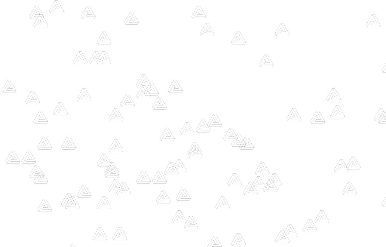
I decided to use mixins to keep the styles within the class declaration nice and succinct. Here's a mixin for random positioning:
@mixin random-position {
  position: absolute;
  left: random(100) + vw;
  top: random(100) + vh;
}

.floater {
  $n: 200;
  @for $i from 0 through $n {

    &--#{$i} {
      @include random-position;
    }
  }
}
This uses random to give each Floater a random left and top. This dotted the Floaters around nicely like so:
Random spin
Here's the code to make the Floaters spin:
@mixin spin-animation($i, $initialRotate) {
  @keyframes spin#{$i} {
    0% {
      transform: rotate($initialRotate + deg);
    }
    100% {
      transform: rotate($initialRotate + 360deg);
    }
  }
}

.floater {
  $n: 200;
  @for $i from 0 through $n {
    @include spin-animation($i, $initialRotate);
    &--#{$i} {
      @include random-position; // as before

      > img {
        transform-origin: top left;
        animation: spin#{$i} 30s linear infinite;
      }
    }
  }
}
I went with this because:
- Each
Floaterhas its own starting degree of rotation, so they weren't all rotating uniformly. - Having the
transform-origin: top leftmakes them appear to move around more aimlessly.
Here's how it looks, we're getting there:
Random floating
Finally, I wanted them to float around like little lost asteriods. I decided to make them take a little journey and return to the original place whilst rotating:
@mixin floater-animation($i) {

  $yOffset: (random(500) - 250) / 100;
  $xOffset: (random(500) - 250) / 100;
  @keyframes floater#{$i} {
    0% {
      transform: translateY(0) translateX(0);
    }
    50% {
      transform: translateY($yOffset * 30vh) translateX($xOffset * 30vw);
    }
    100% {
      transform: translateY(0) translateX(0);
    }
  }
}

.floater {

  $n: 200;
  @for $i from 0 through $n {

    @include spin-animation($i, $initialRotate); // as before
    @include floater-animation($i);
    &--#{$i} {
      @include random-position; // as before      $floaterDuration: random(10) + 5;
      animation: floater#{$i} #{$floaterDuration}s ease-in-out infinite;

      > img {
        transform-origin: top left;
        animation: spin#{$i} 30s linear infinite;
      }
    }
  }
}
All the magic numbers in the CSS are based on what felt right when playing around locally with it. Since this was a bit of fun, and I'd sunk plenty of time into this already, I decided this was good enough to chuck into production.
But what does the javascript look like?
As you saw above, my SASS code is pretty questionable, but here's how much Floater function component shaped up:
import "/src/styles/floater.scss"

function Floater({name, index}) {
    const imageUrl = `./${import.meta.env.BASE_URL}/floaters/${name}`;
    return (
        <div className={`floater floater--${index}`}>
            <img src={imageUrl} alt="floater"/>
        </div>
    );
}

export default Floater;
Told you! No hacky javascript 😎. I needed to have a div and img so that they could have the floaterX and spinXanimations respectively.
Here's how my site looks without those styles imported:
Pretty boring right? Lastly, and most importantly, I need to consider people accessing my site with accessibility requirements, so I wrapped the animation CSS properties in the following:
@media (prefers-reduced-motion: no-preference) { }
Finally...
As a treat for getting to the end, why don't you try triple-click on my homepage and see what happens...